“When you change the way you look at things, the things you look at change.”
– Max Planck
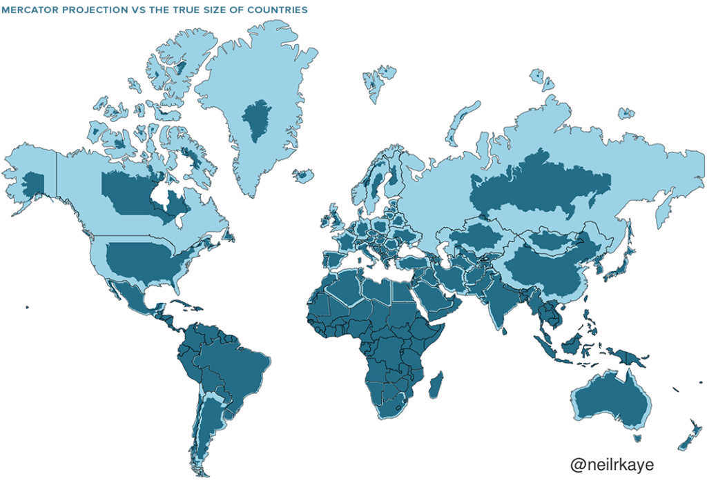
Some people think the world can never change, but it depends how you look at it. Sometimes, perception eclipses fact. The Mercator Projection was created by Gerardus Mercator in 1569 and provides the map of the world we all recognise. But there’s a problem; the world doesn’t actually look like that. Greenland isn’t the huge landmass the map view shows, neither is the US, Canada, or Russia. Mercator’s map inadvertently inflates Europe and North America, more so as they get further away from the equator. Visually speaking, Canada and Russia appear to take up approximately 25% of the Earth’s surface, when in reality they occupy a mere 5%. Africa and Australia come away more or less unscathed, as does South America.
All very interesting. So, what does the world really look like and why is there such a variation? The Mercator version uses a cylindrical model, best suited for nautical navigation as every line on the sphere is a constant course (or loxodrome for those familiar with the subject). The problem stems from the fact that the world is spherical, not cylindrical, and critics took issue with the resultant warped view of major landmasses, especially the African continent.
Here’s a before and after Mercator Projection for you to compare. In case you hadn’t guessed, the darker blue is the actual size of the relevant landmass!
Mercator Projection
Maps are important tools, whether it’s finding a destination, the best route from A to B, or helping us form opinions about geopolitics and the environment. Accuracy is essential if you want to get where you want to go, and in the time you anticipated.
We prefer an accurate world view when it comes to investment planning which is why we adopt a truly proportionate global market perspective. For many investors, the map is skewed with the UK being the dominant landmass (home bias investing) while in fact it only represents about 5% of the world’s market capitalisation. We prefer to exploit the full global investment opportunity set, so our portfolios replicate the world share and bond markets in terms of size and scale.
Here is an accurate map of the world stock markets in terms of capitalisation (size), with some surprising results:
Percent of world market capitalisation as at December 31, 2018
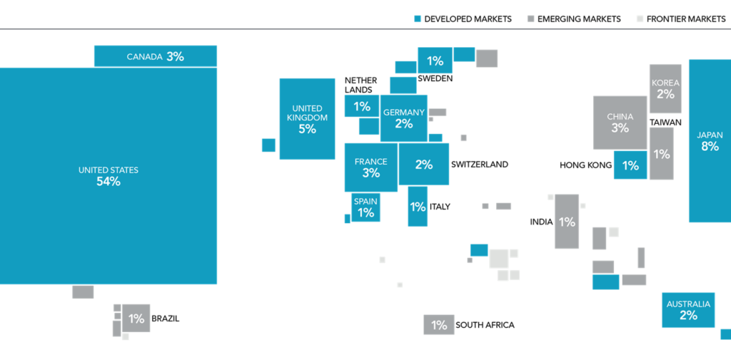
This is the global investment map as it really is, not a Mercator Projection. It’s important we don’t limit or blinker our view. So, while Mercator may have changed the way we see the world, when it comes to investing our clients’ money, we prefer seeing things as they really are.
Fact, not perception.